STAGE three
MIRROR
Playing on the idea of perspectives, I wanted to look at showing two perspectives at once in the same photo like how Guillaume Amat uses a mirror.
GUILLUME AMAT


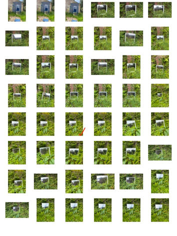
For these pictures, I went to Phillips park to use the abandoned observatory used in previous stages. I think that it looks more interesting to show different perspectives of as its not your conventional building.
contact sheets
selections
annotations

Framing: The doorway and steps frame the mirror, drawing the viewer's eye directly to it. This technique helps to focus attention on the reflection within the mirror and creates a sense of depth.
Leading Lines: The steps lead the viewer's eye up towards the mirror.
DEPTH OF FIELD
Leading Lines: The horizontal lines of the wooden planks and the pipe lead the viewer's eye towards the mirror..
Texture: The rough texture of the wooden wall and the ground provides a stark contrast to the smooth, reflective surface of the mirror. This juxtaposition adds depth and interest to the image.
Contrast: There is a notable contrast between the weathered, textured wooden wall with graffiti and the clear, vibrant reflection of greenery in the mirror.

development
Using photoshop, I colour selected all my photos. I did this to emphasise the fact that the mirror displays a completely different perspective and using colour against black and white amplifies this contrast.


